
Email: feralandproud1@gmail.com
Call:
+44(0)7306329150


YAMI-ICHI
YAMI-ICHI (‘Black market’ in Japanese) started from this simple but important question. They challenge the current perception of art as a commodity in a capitalistic art market by designing a space where various ways of valuing art can be exchanged more freely. YAMI-ICHI is an international art project that replicates a traditional art auction, but replaces cash payments with non-monetary trade-offs and exchanges. The project encourages young and emerging artists to re-evaluate how their work can be perceived and connect them with potential clients or future collaborators.
Project Name: We Are Art
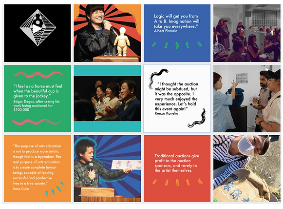
Yami-Ichi Art is a social experiment and destabilizing art selling movement. In a world desperate to challenge established economies and systems of value, Yami-Ichi pioneers an art auction reliant on a return to bartering systems. A revolution!
I was invited to observe and participate in a Yami-Ichi Art auction in the height of the pandemic. After-which I was asked to produce a commentary/ discussion of what I had observed. This was published widely on LinkedIn by the founder and her associates.
I subsequently took this article and created a personal graphic design project from it. I created YAMI-ICHI ART: We Are Art, a fictional magazine with its own movement, culture and following. I designed and illustrated the magazine, organization advertising, and experimented with possible merchandise.

Visual Research.
I conducted web-based research into the meaning and relevance of specific colours in Japanese culture. I also explored the extended meanings of Yami-Ichi and unpacked YAMI-ICHI ART's online character and presence to gain a better understanding of their brand identity.
I enjoyed researching Japanese street art and printed adverts. The colours, textures and patterns feel alive.

-YAMI-ICHI ART's social media and website reveal a balance between minimalism, brush texture, line work and high pigmentation.
-The application of both clean sans serif typeface and geometric abstract vector marks communicates commercial professionalism. The human experience is acknowledged in the form of natural photos, quotes and hand drawn detail.
- The analogue details creates a charming and playful character, whilst adding movement to an otherwise static website and social media presence.


Colour.
The colours that carry the brands identity are highly motivational, uplifting yet powerful. Almost dangerous. The colour black in Japanese culture represents formality, elegance, and mourning. While the colour red represents protection, strength, peace and power. Red is also said to scare away evil spirits. Orange and yellows are considered uplifting, promote love, joy, and are akin to the sun and youthfulness. These colours within the designs will be used to communicate cross-national meaning but also establish visual continuity with the existing YAMI-ICHI ART website.


I tried to paint the characters for Yami-Ichi using black acrylic paint. I felt that analogue methods were the most impactful for visually building a brand identity that put the artist first.
This approach, in my opinion, was somewhat anti-design. Experimenting with typography as well as with my interpretation of a traditional human figure-maintained balance when choreographed alongside the clean lines, structure and formality of the sans serif typeface and abstract geometric mark. It transformed the assets in to a functional work of art.
Movement + Texture =
Character

-Yami-ichi is written as “dark city” and means “black market.”

Design, execute, reflect, tweak, and repeat.
Aspects of my initial spread design were delivering the character and energy I wanted. For example, the scribbled monochromatic illustrations added texture, movement and punctuated the sentiments of the body text.
I painted and drew all elements using analogue inks, acrylic paints, and dry-distressed brushes for added texture and movement. Once scanned in, I increased their contrast and deepened the richness of the blacks to achieve greater impact and contrast against a white page.
I appreciated the visual impact of the article’s headline typeface. The crossing out line is both jarring and rebellious. It is an implied physical action.
However, aspects of the layout did not create enough contrast or entice the reader to want to read on. My use of pull-quotes was not formatted well. They did not have the size or weight to create enough contrast against the body copy.
My page numbers were all over the place which did not positively contribute to the readability or navigation of the article, and while a monochromatic theme looked harmonious, it did not deliver the edge or vibrancy I wanted to deliver. More importantly, it was not aligned with the brand identity or character.

Design in Use.
The Magazine.
I added elements of red throughout the design and layout subtly. It almost punctuates the overall layout. By making the dash lines through the heading red, you are making a strong statement of rejection, erasing, and crossing out. This is reinforced by the meaning placed on the colours red and black within Japanese culture.
The spot illustrations are playful and align with the brand character. I decided to only have the page number on the facing page in the left-hand corner as it de-cluttered the composition.
I increased the weight and size of the pull-quotes with oversized quotation marks. By positioning these quotes in organic break points the body copy looks like a less daunting proposition.


The
Advert.
This street advert is designed to be in areas of high foot fall, where pedestrians linger and take their time. A shopping centre for example. I Wanted to create an advert that was both entertaining, educational and functional.
The street advert plays with balance, hierarchy and composition to create an asset that embodies elements of Japanese street art and adverts.
Through my use of san serif aligned to the left, The design communicates formality, refinement, and structure. This is reflected in the bottom right corner where my use of experimental typography offsets the abstract analogue texture and wildness in the top right corner. There is justified symmetry and balance within this somewhat overwhelming composition.
Inspired by Japanese street art and packaging, I took the abstract vector mark for YAMI-ICHI ART and transformed it into a warn stamp to reduce its perfection and make it more a point of curiosity and intrigue.
The use of high saturation and high contrast inspires action and a heightened sense of stimulation. The use of this strategy, and the application of colour theory in this way aims to create an advert the viewer remembers.
The red analogue painted figure is in the foreground and the main character. This form represents the prioritising of the human experience by YAMI-ICHI ART. It highlights our connectivity and the fact that ‘how we move and what we are is in fact art’. We are art. The form's more rustic and primal visual narratives is communicating a return to archaic bartering systems and the strength, positivity and protection of embracing our interconnectivity.


Interactive art for a person centred brand...
By manipulating the 'J' in Join the dark side and feeding it in to the 'T' I wanted to create a point of curiosity and playfulness within an otherwise formal text block.
Because the core of the brand is person centred and emphasises the need for art to be more accessible while truly benefiting the artist, the addition of a QR code adds an extra point of interactivity and engagement with the general public. The QR code could guide participants to a video or information page on the YAMI-ICHI ART website. It could provide the viewer with a free digital screen wallpaper, or a live, an urban artistic treasure hunt, or digital art auction.
Including the QR code is an additional act of breaking down barriers, but in a contemporary way fitting for a progressive brand identity that leverages trans-media platforms.
The
Merchandise.
I created a collection of interior and wearable merchandise that continued the themes and reinforced the character and brand identity. To wear and display YAMI-ICHI ART is to be a part of something bigger. To make a statement. To embrace both the traditional and the progressive. It is a lifestyle.


Poster 2.
I created an alternative poster design that is far more minimalist than the original. It adopts elements of a geography of science poster. With cultural explanations of the brand colour swatches in the bottom right corner and definitions of Yami-Ichi in the top.
I applied vivid minimalism in this design as it creates a strong visual impact. It draws attention to key elements and the simple and uncluttered design communicates far more effectively.
A mild 'Z' layout and significant amount of white space contrasts harmoniously with the dominant, texture rich and highly pigmented symbols for Yami-Ichi that are central to the composition.
I repeated the warn stamp of the organizations vector mark as I feel that reference to Japanese street art and packaging is contextually valuable and adds a sense of authenticity.
